Thursday, October 28, 2010

CoolTuts - QTP - Object Repository

Recording Object information is stored in Object Repository. In this you can see all objects properties and you can edit, modify or delete the properties of the objects. The objects and properties stored in object repository are called as Test Objects or TOproperties.

Types of Object Repository

There are two types of Object Repository.
1. Shared Object Repository
2. Local Object Repository

Shared Object Repository: This repository stores objects in a file that can be accessed by multiple tests.

Local Object Reposity: This repository stores objects in a file, that is associate with a single action


Adding Objects
In the Object Repository window, choose Object > Add Objects to Local. Click the object you want to add to your object repository.

If the object is associated to any other object, then use the following dialog box.


Selected object only - Adds selected object's properties and values, without its descendant objects.
Default object types - Adds selected object's properties and values of its descendant objects according to the object types specified by the default filter. You can see which objects are in the default filter by clicking the Select button and clicking the Default button.
All object types: Adds selected object's properties and values, together with the properties and values of all of its descendant objects.
Selected object types Adds selected objects properties and values, as well as the properties and values of its descendant objects according to the object types and classes you specify in the object filter. You specify the objects and classes in the filter by clicking the Select button and selecting the required items in the Select Object Types dialog box.

Friday, October 22, 2010

ASP MultiView and View Server Control

The MultiView and View server controls work together to give you the capability to turn on/off sections of an ASP.NET page. Turning sections on/off is nothing activating and deactivating a series of View controls within a MultiView control. This looks similar to changing visibility of Panel controls but this concept will look easy when you work with multi view control.

Example:
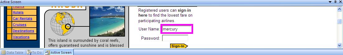
The Design of MultiView Control looks like this (Figure below)

Firgure 1 Goes Here.

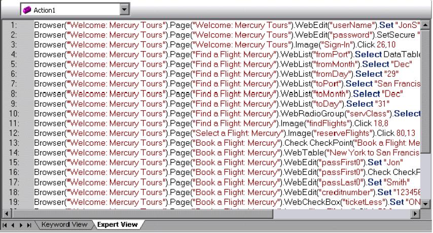
Above figure is a design mode in our visual studio. Then we need to have events for over button clicks. What I am doing here is when I click button in 1st View it should replace with second view see sample images below.

Figure 2, 3, 4 Goes Here.

So by above figures you should get some idea that what this example is doing. For every view next button replacing with next View control and for every previous button is replacing with previous View control.

To get Next View we use
MultiView1.ActiveViewIndex += 1;

To get Previous View we use
MultiView1.ActiveViewIndex -= 1;

Complete code looks like

.aspx

<asp:MultiView ID="MultiView1" runat="server">
<asp:View ID="View1" runat="server">
<asp:Label ID="Label1" runat="server" Text="FirstName:"></asp:Label>
<span lang="en-us">  </span>
<asp:TextBox ID="txtFirstName" runat="server" />
<asp:RequiredFieldValidator ID="RequiredFieldValidator1" runat="server"
ControlToValidate="txtFirstName" ErrorMessage="FirstName is required"></asp:RequiredFieldValidator>
<br />
<asp:Label ID="Label2" runat="server" Text="Last Name:"></asp:Label>
<span lang="en-us"> </span><asp:TextBox ID="txtLastName" runat="server" />
<asp:RequiredFieldValidator ID="RequiredFieldValidator2" runat="server"
ControlToValidate="txtLastName" ErrorMessage="Last Name is required"></asp:RequiredFieldValidator>
<br />
<asp:Button ID="btnNextView1" runat="server" Text="Next Step" onclick="Button1_Click" />
</asp:View>
<asp:View ID="View2" runat="server">
<asp:Label ID="Label3" runat="server" Text="DOB:"></asp:Label>
<span lang="en-us">  </span>
<asp:TextBox ID="txtDOB" runat="server" /> <asp:RequiredFieldValidator ID="RequiredFieldValidator3" runat="server"
ControlToValidate="txtDOB" ErrorMessage="DOB is required"></asp:RequiredFieldValidator><br />
<asp:Label ID="Label4" runat="server" Text="Phone Number:"></asp:Label>
<span lang="en-us">  </span>
<asp:TextBox ID="txtPhoneNumber" runat="server" /><asp:RequiredFieldValidator ID="RequiredFieldValidator4" runat="server"
ControlToValidate="txtPhoneNumber" ErrorMessage="Phone Number is required"></asp:RequiredFieldValidator><br />
<asp:Button ID="btnPrev2View1" runat="server" CausesValidation="false" Text="Previous Step"
onclick="Button3_Click" />
<asp:Button ID="btnNextView2" runat="server" Text="Next Step"
onclick="btnNextView2_Click" />
</asp:View>
<asp:View ID="View3" runat="server">
<asp:Label ID="lblFinalResult" runat="server"></asp:Label>
<asp:Button ID="btnPrev3View1" runat="server" Text="Previous Step" onclick="Button3_Click" />
<asp:Button ID="Button1" runat="server" Text="Finish"
onclick="Button1_Click1" />
</asp:View>
</asp:MultiView>

.cs

protected void Page_Load(object sender, EventArgs e)
{
if (!IsPostBack)
{
MultiView1.ActiveViewIndex =0;
}
}
protected void Button1_Click(object sender, EventArgs e)
{
MultiView1.ActiveViewIndex += 1;
}
protected void Button3_Click(object sender, EventArgs e)
{
MultiView1.ActiveViewIndex -= 1;
}
protected void Button1_Click1(object sender, EventArgs e)
{
Response.Redirect("http://www.cooltuts.com/");
}
protected void btnNextView2_Click(object sender, EventArgs e)
{
MultiView1.ActiveViewIndex += 1;
lblFinalResult.Text = "<b>Your Contact Details</b>"+"<br/>"+
"First Name: "+txtFirstName.Text+"<br/>"+
"Last Name: "+txtLastName.Text+"<br/>"+
"Date of Birth: "+txtDOB.Text+"<br/>"+
"Phone Number: "+txtPhoneNumber.Text+"<br/>"+
"<font size='3' color='red'>Verify and Click submit to Fininsh you registration</font><br />";
}

Thursday, October 14, 2010

Build in Functions

IsNumeric Function
IsDate Function
Year Function
Date Function
Time Function


IsNumeric Function: Evaluates whether an expression can be converted to Date or Not.
Example:
Dim MyVar, MyCheck
MyVar = 53 ' Assigns a Numeric value.
MyCheck = IsNumeric(MyVar) ' Returns True.
MsgBox MyCheck
MyVar = "459.95" ' Assigns a String which consists of Number
MyCheck = IsNumeric(MyVar) ' Returns True.
MsgBox MyCheck
MyVar = "45 Help" ' Assigns a String.
MyCheck = IsNumeric(MyVar) ' Returns False.
MsgBox MyCheck

IsDate Function: Evaluates whether an expression is a number or not.
Example:
Dim MyDate, YourDate, NoDate
MyDate = "October 19, 1962": YourDate = #10/19/62#: NoDate = "Hello"
Msgbox "Value of MyDate is "&IsDate(MyDate)
Msgbox "Value of Your Date is "&IsDate(YourDate)
Msgbox "Value of NoDate variable is "&IsDate(NoDate)

Year Function: Returns the whole number representing an Year
Dim MyDate, MyYear
MyDate = #October 19, 1962# ' Assign a date.
MyYear = Year(MyDate) ' MyYear contains 1962.

Date Function: Returns the current system date.
MyDate = Date
Msgbox "Today's Date is "&MyDate

Time Function: Returns the current system time.
MyTime = Time
Msgbox "Current Time is "&MyTime

Wednesday, October 13, 2010

CoolTuts - QTP - Synchronisation

You can also synchronise your test to ensure that your application is ready to perform next step in your test.

CoolTuts - QTP - Step Generator

Step Generator guides you step-by-step through the process of adding recordable and non-recordable operations.

CoolTuts - QTP - Actions

You can divide your test into actions to streamline the testing process of your application.

CoolTuts - QTP - Output Values

You can retrieve values from your application at run time and store them in the Data Table as output values.

CoolTuts - QTP - Parameterizing

When you want to test your application, you may want to check how it performs the same operations with different data. This is called parameterizing your test.

We can parameterizing the scripts by using any of the following

  1. DataTable
  2. Environment Variables
  3. Action Parameters
  4. Random number parameters

CoolTuts - QTP - Checkpoints

A checkpoint compares the value of an element captured, when the object was saved in the object repository, with the value of the same element captured during the run session.

CoolTuts - QTP - Available Keywords Pane

Available keywords pane enables to drag and drop objects or calls to functions into your test. When you drag and drop an object into your test, QTP inserts a step of operations for that object.

To view Available Keywords pane, click the Available Keywords Pane button or select View > Available Keywords.

CoolTuts - QTP - Virtual Objects

Virtual objects enables to record and run tests on objects that are not normally recognized by Quick Test.

Using the Virtual Object Wizard

  1. Map a virtual object to a standard object class such as a button or a check box.
  2. Specify the boundaries & the parent of the virtual object
  3. Assign a name to the virtual object

To Add a Virtual Object Tools > Virtual Objects > New Virtual Object


CoolTuts - QTP - Working with Reporter Object

Reporter Object is used to send information to test results.

ReportEvent Method: Reports an event to the test results
Syntax
Reporter.ReportEvent EventStatus, ReportStepName, Details [, Reporter]
EventStatus: 0 or micPass, 1 or micFail, 2 or micDone, 3 or micWarning
Example:
If(Window("text:=Untitled - Notepad").Wineditor("Class Name:=WinEditor").Exist)Then
Window("text:=Untitled - Notepad").Wineditor("Class Name:=WinEditor").Type("hello")
Reporter.ReportEvent 0, "Notepad exists", "Editor exists for the notepad"
else
Reporter.ReportEvent 1, "Notepad exists", "Editor exists for the notepad"
End if

Analysing Test Results

When a run session ends, the results can be viewed in the Test Results window. By default, the Test Results window opens automatically at the end of a run.
Tools > Options > Run Tab > View results when run session ends

Running Test Scripts

After you create a test, you can run it to check the behavior of your application.

  1. Running your Entire test
    QuickTest always runs a test from the first step, unless you specify otherwise. To run a test from or to a selected step or action, you can use the Run from step or Run to step options
    Ex: Click the Run button on the toolbar or choose Automation > Run

  2. Running part of your test
    You can use the Run from step option to run a selected part of your test. This enables you to check a specific section of your application or to confirm that a certain part of your test runs smoothly.
    Ex: Automation > Run from Step


Transactions

You can measure the amount of time it takes for your application to perform steps in a test by defining and measuring transactions.


  1. Measures the time taken to run a section of your test.
  2. Sections of test are enclosed with start and end transaction statements.
  3. StartTransaction step signals the beginning of time measurement.
  4. Time measurement continues until EndTransaction step is reached.

To Insert Transaction, click on Start Transaction button (or)
Choose Insert > Start Transaction
To End Transaction, click on End Transaction button (or)
Choose Insert > End Transaction

Transaction (Keyword View):


Transaction (Expert View):
Services.StartTransaction “NameOfTransaction"
…... Few Statements…...
Services.EndTransaction “NameOf Transaction"

Tuesday, October 12, 2010

Object Spy


Using Object Spy you can view the properties and methods of any object in an open application. You use the object spy pointer to point to an object. Using the Object Spy pointing hand mechanism, you can view the supported properties and methods of any object in an open application.

Object Spy dialog box displays the selected object's hierarchy tree. It displays the run-time or test object properites and values of the selected object in the Properties tab. It displays the run-time or test object methods associated with the selected object in the Methods tab.

Choose Tools > Object Spy or click the Object Spy toolbar button to open the Object Spy dialog box.
Click the pointing hand. Both QuickTest and the Object Spy are minimized so that you can point to any object on the open application.

Low Level Recording

  1. For recording on environments or objects not supported by Quick Test.
  2. When you need to record the exact location of the operation on your application screen. While recording in normal mode, Quick Test performs the step on an object even if it has moved to a new location on the screen. If the location of the object is important to your test, switch to Low Level Recording to enable Quick Test to record the object in terms of its x- and y- coordinates on the screen. This way, the step will pass only if the object is in the correct position.
  3. In this Quick Test records all parent level objects as Window test objects and all other objects as WinObject test objects. They are displayed in the Active Screen as standard Windows objects.
  4. It supports the following methods for each test object:
    WinObject test objects: Click, DblClick, Drag, Drop, Type
    Window test objects: Click, DblClick, Drag, Drop, Type, Activate, Minimize, Restore, Maximize
  5. Each step recorded in Low Level Recording mode is shown in the Keyword View and Expert View. (Analog recording records only the one step that calls the external analog data file.)

To record an application using Low Level Recording,
click the Low Level Recording button or choose Automation > Low Level Recording

Analog Recording Mode

Use this for applications in which the actual movement of the mouse is what you want to record. These can include drawing a mouse signature or working with drawing applications that create images by dragging the mouse.

To Record an application using analog recording mode,
select Automation > Analog Recording or click on Analog Recording button


Analog Recording mode
1. Record relative to a specified window
2. Record relative to the screen

For Record relative to the screen, QuickTest inserts the RunAnalog step for a Desktop item. Ex: Desktop.RunAnalog "Track1"

For Record relative to the following window, QuickTest inserts the RunAnalog step for a Window item. Ex: Window("Microsoft Internet Explorer").RunAnalog "Track1"

The track file called by the RunAnalog method contains all your analog data and is stored with the current action

Recording Modes of QTP

Recording Modes in QTP

  1. Normal Recording: Records the objects and the operations performed on them. (default mode)
  2. Analog Recording: Records the exact mouse and keyboard operations you perform in relation to either screen or the application window. In this recording mode, Quick Test records and tracks every movement of the mouse as you drag the mouse around a screen or window.
    This mode is useful for recording operations that cannot be recorded at the level of an object, for example, recording a signature produced by dragging the mouse.
  3. Low-Level Recording: Records on any object in your application, whether or not Quick Test recognizes the specific object or specific operation

Both Analog & Low-Level Recording requires more disk space


Guidelines for Analog and Low Level Recording

  1. Use analog recording or low-level recording only when normal recording mode does not accurately record your operation.
  2. Analog recording and low-level recording require more disk space than normal recording mode.
  3. You can switch to either Analog Recording or Low Level Recording in the middle of a recording session for specific steps. After you record the necessary steps using analog recording or low-level recording, you can return to normal recording mode for the remainder of your recording session.

Normal RecordingAnalog RecordingLow Level Recording
Records Objects Information based on Test Object ModelRecords Mouse Movements respect to window or screenRecords All Objects as windows or win objects
Records Keyboard InputsRecords Keyboard InputsRecords Keyboard Inputs
Records Mouse ClicksRecords Mouse ClicksRecords Mouse Clicks with coordinates
Object Information is stored in Object RepositoryIt Can't record Object InformationRecords object information in the form of window or win objects
It is possible to edit scripts after recordingNot possible to edit the scripts after recordingIt is possible to record scripts after recording
Recording a Signature is not possibleAlternative mode for recording signatures
Recorded steps will run correctly on all objectsWhen we are recording with respect to window, the window object information will stores in object repositoryRecorded steps may not run correctly on all objects
Support all methods for every object Support the following methods for each test object
Win test objects: Click, DblClick, Drag, Drop, Type
Window Test Objects: Click, DblClick, Drag, Drop, Type, Activate, Minimise, Restore, Maximise
This is a Default Recording Mode

Components of QTP

  1. Missing Resource Pane
  2. Data Table
  3. Debug Viewer
  4. Active Screen
  5. Object Spy
  6. Available Keywords Pane
  7. Object Repository
  8. Information Pane

Missing Resource Pane

It provides a list of the resources that are specified in your test but cannot be found

  1. Missing calls to actions
  2. Unmapped shared object repositories
  3. Parameters that are connected to shared object repositories.

If one of the resources listed in this pane is unavailable during a run session, the test may fail. You can map a missing resource, or you can remove it from the test, as required.
To show or hide the Missing Resources pane, choose View > Missing Resources or click the Missing Resource button

The Missing Resources pane may list any of the following types of missing resources:

  • Missing Action Name
  • Missing Object Repository
  • Repository Parameters


The Missing Resource pane consists of the following columns

  1. Items column lists the missing resource.
  2. Details column provides information about missing resource.

Data Table


It contains one Global tab plus an additional tab for each action.
It assists in parameterizing your test.
To view the Data Table, click Data Table toolbar button or choose View > Data Table.
For every new action, a new action sheet is added.
Action sheets are automatically labeled with the exact name of the corresponding action.

Debug Viewer

Debug Viewer assists you in debugging the Script.

There are Three tabs in Debug Viewer of QTP
a. Watch
b. Variables and
c. Command
  1. Watch tab:It enables you to view the current value of any variable or VBScript expression that you added to the Watch tab.
  2. Variables tab: During a run session, the Variables tab displays the current value of all variables that have been recognized up to the last step performed in the run session.
  3. Command tab: It enables to run a line of script to set or modify the current value of a variable or VBScript object in your function library. When continued to the run session, Quick Test uses the new value that was set in the command.


To view the Debug Viewer pane, click the Debug Viewer button or choose View > Debug Viewer

Active Screen


Active Screen provides a snapshot of your application in a recording session and enables you to insert additional steps on the test objects captured in that screen after the recording session.

To view the Active Screen pane, click the Active Screen button or choose View > Active Screen.

QTP Script View

There are two types in which you view the Script
  1. Keyword View
  2. Expert View

For each row in the Keyword view, QuickTest displays a corresponding line of script in Expert view.

Expert View

In Expert View, each step is represented as VB Script line or Statement. Expert view is a script editor with many script editing capabilities.

Keyword View

When you create a test, QTP Creates a graphical representation of the steps you perform on your application. These steps are displayed in Keyword view tab.


Keyword view shows object hierarchy in an icon-based table.

Keyword view enables to view the tests of your test in a keyword-driven, modular, table format. Each step is represented as a seperate row in the table.

The columns in the Keyword View show different information for each step, as follows:

  1. Item: Test object, utility object, function call, or statement in a hierarchical icon-based tree.
  2. Operation: Operation to be performed on the item, Ex: Click or Select.
  3. Value: Argument values for the selected operation, Ex: mouse button to use when clicking the image.
  4. Documentation: Auto-documentation of what the step does, in an easy-to-understand sentence. Ex: Click "findFlights" image.
  5. Assignment: Assigning a value to or from a variable (not visible by default.)
  6. Comment: Textual information regarding the step, (not visible by default.)

Regular Expressions

There are three types of String Matching Pattern in Selenium.

1. glob:pattern - "Glob" is a kind of regular expression used in command line shells.
In glob pattern * represents any sequence of characters. '?' represents a single character.
2. regexp:regexp -Uses Javascript regular expressions
3. exact:string-Match a string exactly

Element Locators in Selenium

Element locators tell selenium which HTML element a command refers to.
Format of element locator is:
locatortype = argument

1. Locating by identifier
identifier = id
Selects an element with specified @id attribute.If no match is found, it will take the element with @name = id.

2. Locating by Name
name = name
Selects the first element with specified @name attribute. If multiple elements have the same value for a name attribute, then you can use filters to further refine your location strategy (matching the value attribute).

3. Locating by id
id = id
Selects the element with @id attribute.

4. Locating by DOM
The Document Object Model represents an HTML document and can be accessed using JavaScript.
dom = javascriptExpression
Example:
dom=document.forms['myForm'].myDropdown

5. Locating by XPath
xpath = xpathExpression
Locates an element with XPath expression.

XPath is the language used for locating nodes in an XML document. As HTML can be an implementation of XML (XHTML), Selenium users can leverage this powerful language to target elements in their web applications.
One of teh main reasons for using XPath is when you don't have a suitable id or name attribute for the element you wish to locate. You can use XPath to either locate the element in absolute terms, or relative to an element that does have an id or name attribute.
Absolute XPaths contain the location of all elements from the root and as a result are likely to fail with only the slightest adjustment to the application.
In Relatiion XPath, we can find a nearby element with an id or name attribute (ideally a parent element), you can locate you target element based on the relationship. This is less likely to change and can make your tests more robust.

Since only xpath locators start with "//", it is not necessary to include the xpath=label when specifying an XPath locator.

Example:
xpath=//img[@alt='The image alt text']
xpath=//table[@id='table1']//tr[4]/td[2]
xpath=//a[contains(@href,'#id1')]

6. Locating Hyperlinks by link Text
link = textPattern
Selects a link with specified text. If two links with the same text are present, then the first match will be used.

7. Locating by CSS
CSS (Cascading Style Sheets) is a language for describing the rendering of HTML and XML documents. CSS uses Selectors for binding style properties to elements in the document. These selectors can be used by Selenium as another locating strategy.
css = cssSelectorSyntax

8. ui = uiSpecifierString

Without an explicit locator prefix, selenium uses the following default strategies:
1. dom, for locators starting with document.
2. xpath, for locators starting with //

Monday, October 11, 2010

Debug Viewer

Debug Viewer helps in debugging tests with the help of Watch Expressions, Variables and Commands.

Testing Process in QTP

  1. Analysing Application
  2. Create Test Scripts
  3. Enhancing Test Scripts
  4. Running Test Scripts
  5. Analysing Test Results

Analysing Application: Determine the various activities that customers perform in your application, to perform a particular task.

Divide the business process into smaller units which will be represent by test actions.

Each action should emulate an activity that a customer might perform while using your application.

Creating Test Scripts: Create a Test script, by recording a manual Test Scenario, in Application Under Test (AUT)

Enhancing Test Scripts

Running Test Scripts: QTP Connects to website or AUT and performs each operation in the test as performed manually while creating/recording tests.

Analysing Test Results: QTP Test Results are analysed.

Sunday, October 10, 2010

CoolTuts - JavaScript - Strings

Concatenating Strings: To concatenate strings we use '+' operator

public class exercise{
public static void main(String[] args)
{
String FirstString = "Abc"
String SecondString = "def"
String FinalString;
FinalString = FirstString + SecondString;
System.out.println("Cancatenated String "+ MyString);
}
}

Length of the String: Returns the number of characters in the String.
String myStr = "abc"
System.out.println("Length of the string "+myStr.length());

IndexOf: Returns the position of the character in the String
String myStr = "abcdefg"
System.out.println("Position of the character "+myStr.IndexOf("c"));//Returns 2
System.out.println("Position of the character "+myStr.IndexOf("z"));//Returns -1 as character is not present in string

Thursday, October 7, 2010

File Upload Server Control

This control is used to upload a file and save file to a specific location using some properties.
A typical File Upload Control is constructed in the following manner:

<asp:FileUpload ID="FileUpload1" runat="server" />

For an Example of using FileUpload control and to save on local computer.


I am using extra button control and one label control.

.aspx

<asp:FileUpload ID="FileUpload1" runat="server" />
<br />
<br />
<asp:Button ID="Button1" runat="server" Text="Upload" onclick="Button1_Click" />
<br />
<br />
<asp:Label ID="Label1" runat="server"></asp:Label>

.cs

protected void Button1_Click(object sender, EventArgs e)
{
if (FileUpload1.HasFile)
{
try
{
FileUpload1.SaveAs("C:\\Uploads\\"+FileUpload1.FileName);
Label1.Text = "File name: " +
FileUpload1.FileName + "<br/>" +
FileUpload1.PostedFile.ContentLength + " kb<br/>" +
"Content type: " +
FileUpload1.PostedFile.ContentType;
}
catch(Exception ex)
{
Label1.Text = ex.Message.ToString();
}
}
else
{
Label1.Text = "You have not added a file";
}
}

You can check whether your file uploaded to your local folder or disk.

If you see your file that’s it you are done with this control.

Thanks
Emmaneale Mendu
Web Developer

ASP PlaceHolder Control

A Placeholder as its name implies – it is a placeholder for controls or objects.

To see how it works, insert a PlaceHolder control into your page and then add controls to it from your server-side code in the manner shown below.

.aspx

<asp:PlaceHolder ID="PlaceHolder1" runat="server"></asp:PlaceHolder>

.cs

Label lblMessage = new Label();
lblMessage.Text = "Hello World I am Cool";
PlaceHolder1.Controls.Add(lblMessage);

Here we are creating a new instance of Label control and adding it to placeholder control. You can add more than one control to a single instance of a PlaceHolder control.

Thanks
Emmaneale Mendu
Web Developer.

ASP Panel Server Control

This control is used to display a set of controls in one unit. It is basically a wrapper for other controls, enabling you will get group of server controls along with other elements like images etc.

The new feature in the panel control is the capability to scroll with scrollbars that appear automatically depending on the amount of information that panel control holds.

For a example below Figure shows where panel holds table control


<asp:Panel ID="Panel1" Width="100px" Height="100px" ScrollBars="Auto" runat="server">
<table>
<tr>
<td>
This text is to test the scrollbar in panel control.
If this text extends the limit of the panel control
the scrollbars appear
</td>
</tr>
</table>
</asp:Panel>


You can add controls dynamically too.

.cs

Label lblMessage = new Label();
lblMessage.Text = "Hello I am new to Panel control";
Panel1.Controls.Add(lblMessage);

That’s it a small explaination on panel control keep reading.

Thanks
Emmaneale Mendu
Web Developer

ASP AdRotator Server Control

This control is used to display collection of advertisements simultaneously, this control automatically rotating advertisements when web page is refreshing, AdRotator control the Microsoft designed based on extensible markup language (XML). So we use XML data to this AdRotator Control.

Right click on your solution file and select add New Item, there you select XML file then press OK.

In xml file add the below code.
<Advertisements>
<Ad>
<ImageUrl>~/Images/CoolTuts.JPG</ImageUrl>
<NavigateUrl>http://www.cooltuts.com/</NavigateUrl>
</Ad>
<Ad>
<ImageUrl>~/Images/PleaseWait.JPG</ImageUrl>
<NavigateUrl>http://www.desibindaas.com/</NavigateUrl>
</Ad>
<Ad>
<ImageUrl>~/Images/Submit.JPG</ImageUrl>
<NavigateUrl>http://www.bing.com/</NavigateUrl>
</Ad>
</Advertisements>

The elements we use mainly in this XML file is explained below.

ImageUrl: Location of your Image.
NavigationUrl: Where to navigate when the image is clicked.
AlternateText: This is useful when there is now image in your file.
Impressions: this indicates the likelihood of the image getting selected for display.
Keyword: this sets the category of the image in order to allow for the filtering of ads.

After adding a XML file to your project with adding above code in it. Its time to add AdRotator to your page with having a property AdvertisementFile=”XML File” as shown below.

<asp:AdRotator ID="AdRotator1" runat="server"
AdvertisementFile="~/XMLFile.xml" />

Hence you see by refreshing the web page. The Ads are changing according to your impression element timings.

Thanks
Emmaneale Mendu
Web Developer.

ASP Literal Control

This control is used to display some text on web page. Same as label control but only difference between these two controls is style property. It won’t allow keeping any styles to the control.

A typical Literal control is written to the page in the following manner.

<asp:Literal ID="Literal1" Text="Hello World!" runat="server"></asp:Literal>

Thanks
Emmaneale Mendu
Web Developer

ASP HiddenField control

This is a client side storage control. The word tells us this control is hiding on web-page right it hides from the world. So, typical hidden field control code looks like below.

<asp:HiddenField ID="HiddenField1" runat="server" />

There are several properties but I just cover two main properties
1) Value
2) Visible

Value: This property is used to assign or store some data in hiddenfield control as shown below.

<asp:HiddenField ID="HiddenField1" Value="Data to be Hidden from Web browser" runat="server" />

Try to work on this it wont display on your web browser.

Visible: This property is optional, but better to know what it does. You are hiding some important data or some confidential data in hidden field. You need to use visible property. why because when you run your program try this way.

Right click on your web browser and select view source. You can see the hidden field value on your source code page. So that reason I use visible property to hide it on view source page too.

<asp:HiddenField ID="HiddenField1" Visible="false" Value="Data to be Hidden from Web browser" runat="server" />

Thank you for reading
Emmaneale Mendu
Web Developer

Wednesday, October 6, 2010

ASP Calendar Server Control

Word calendar makes user to select any date in the history so Microsoft introduced a control named Calendar server control you need to drag and drop control that’s it. A calendar appears on your web page which user can select any date in the history. A typical Calendar control is constructed as shown below.

<asp:Calendar ID="cldControl" runat="server"></asp:Calendar>


Above calendar control is a simple default one you can use some CSS styles or you can get some default designs from this control.

Right click on Calendar control and you see SHOW SMART TAG option


Check that and you see a small window at the top of your Calendar control


Select Auto format then you can select any default style you want sample selection is shown below Press OK.


Selecting a single day in the Calendar control

When user selects the date i am using a label control to display the date.


.aspx

<asp:Calendar ID="cldControl" runat="server"
OnSelectionChanged="cldControl_SelectionChanged" />
<asp:Label ID="lblDisplayDate" runat="server" />

.cs

protected void cldControl_SelectionChanged(object sender, EventArgs e)
{
lblDisplayDate.Text = "You have selected " + cldControl.SelectedDate.ToShortDateString();
}

Selecting whole week or whole month

In this case we use SELECTIONMODE property where you see four option to select Day, DayWeek, DayWeekMonth, None.

None – only readonly calendars use this option

So lets see DayWeekMonth in this below example.


.aspx

<asp:Calendar ID="cldControl" runat="server" SelectionMode="DayWeekMonth"
OnSelectionChanged="cldControl_SelectionChanged" />
<asp:Label ID="lblDisplayDate" runat="server" />

.cs

protected void cldControl_SelectionChanged(object sender, EventArgs e)
{
lblDisplayDate.Text = "You have selected <br/>";

for (int i = 0; i < cldControl.SelectedDates.Count; i++)
{
lblDisplayDate.Text += cldControl.SelectedDates[i].ToShortDateString() + "<br/>";
}
}

That’s it a small post with examples on Calendar control. Thankyou for reading the post.

Emmaneale Mendu
Web Developer

Tuesday, October 5, 2010

Input Box

Displays a prompt in a dialog box, waits for the user to input text or click a button, and returns the contents of the text box.

Example:
Input = InputBox("Input Something","Title of the Input Box","Default Text in the Input Box")
Msgbox ("You Entered " & Input)

BulletedList server Control

This control is just a read only control where you can display the list of items in different formats as shown below.


In the above figure I shown you how it displays when you select different Bulletstyle property options

Circle, LowerAlpha, LowerRoman, UpperRoman etc.

And we have basic properties like BackColor, BorderStyle etc.

.aspx

<asp:BulletedList ID="BulletedList1" BulletStyle="Circle" runat="server">
<asp:ListItem>One</asp:ListItem>
<asp:ListItem>Two</asp:ListItem>
<asp:ListItem>Three</asp:ListItem>
<asp:ListItem>Four</asp:ListItem>
<asp:ListItem>Five</asp:ListItem>
</asp:BulletedList>

That’s it small post on Bulletedlist control.

Thanks
Emmaneale Mendu
Web Developer

ASP Table Server Control

This control is very common in all web pages because by default web page takes <table> tag for layout of your web page. The typical construction of the table server control looks like below code.


In the above figure you can see two headers (“First Name” and “Last Name”). We can use any header here. We have three tags to use in asp table tag

<asp:TableFooterRow></asp:TableFooterRow>
<asp:TableHeaderRow></asp:TableHeaderRow>
<asp:TableRow></asp:TableRow>

You can copy the code below to get the above webpage design

.aspx

<asp:Table ID="Table1" runat="server" Caption="Customer Details">
<asp:TableRow ID="trheader" BackColor="Silver" runat="server" ForeColor="Black" Font-Bold="true">
<asp:TableHeaderCell>First Name</asp:TableHeaderCell>
<asp:TableHeaderCell>Last Name</asp:TableHeaderCell>
</asp:TableRow>
<asp:TableRow>
<asp:TableCell>Emmaneale</asp:TableCell>
<asp:TableCell>Mendu</asp:TableCell>
</asp:TableRow>
<asp:TableRow>
<asp:TableCell>Swetha</asp:TableCell>
<asp:TableCell>Patcha</asp:TableCell>
</asp:TableRow>
</asp:Table>

That’s it a basic asp table design completed.


Dynamically adding rows to the table:


I coded according to get same look as our first image. Just add a table tag in .aspx page and add server side code in page load area.

.aspx

<asp:Table ID="Table2" runat="server">
</asp:Table>

.cs

protected void Page_Load(object sender, EventArgs e)
{
Table2.Caption = "Customer Details";

TableRow tr = new TableRow();
TableCell th1 = new TableCell();
TableCell th2 = new TableCell();
tr.BackColor = Color.Silver;
th1.Text = "First Name";
th2.Text = "Second Name";
tr.Cells.Add(th1);
tr.Cells.Add(th2);
Table2.Rows.Add(tr);

TableRow tr1 = new TableRow();
TableCell tc1 = new TableCell();
TableCell tc2 = new TableCell();
tc1.Text = "Emmaneale";
tc2.Text = "Mendu";
tr1.Cells.Add(tc1);
tr1.Cells.Add(tc2);
Table2.Rows.Add(tr1);

TableRow tr2 = new TableRow();
TableCell tc3 = new TableCell();
TableCell tc4 = new TableCell();
tc3.Text = "Swetha";
tc4.Text = "Patcha";
tr2.Cells.Add(tc3);
tr2.Cells.Add(tc4);
Table2.Rows.Add(tr2);
}

As of now if you try this example you should come to know a basic design and how to dynamically add rows in a table.

That’s it a small post on Table Server control Thanks for Reading.

Yours
Emmaneale Mendu
Web Developer

ImageMap Server Control

ImageMap control is introduced to get Navigation property to Image control as you see image control is missing Navigationurl property. You can have group of images in one image and we can navigate to one or more different url’s. As I mentioned to different url’s I will show you with an example before goin to the example stuff lets see imagemap properties.

Hot spots features:
• Each hot spots is characterized by various attributes like shape, location and size.
• Overlapping hotspots are perfectly valid.
• Hotspots are defined using x and y coordinates.

Types of hot spots
• CircleHotSpot
• RectangleHotSpot
• PolygonHotSpot

CircleHotSpot
We should define X, Y and radius to get this property.

RectangleHotSpot
We should defne Top,Buttom,Left and Right coordinates to get this property.


I got four images in one image and maping images using imagemap to navigation property. when the user clicks on circle or rectangle images I used navigation property to redirect to different urls. As shown above figure the code looks like this.

<asp:ImageMap ID="ImageMap1" runat="server" Height="300px" ImageUrl="~/Images/ImageMap.JPG" Width="300px">
<asp:CircleHotSpot Radius="40" AlternateText="Go to CoolTuts" X="50" Y="218" Target="_blank" NavigateUrl="http://www.cooltuts.com/" />
<asp:RectangleHotSpot AlternateText="Go to Bing" Left="17" Right="85" Top="27" Target="_blank" Bottom="110" NavigateUrl="http://www.bing.com/" />
<asp:RectangleHotSpot AlternateText="Go to Google" Left="140" Right="290" Top="27" Target="_blank" Bottom="110" NavigateUrl="http://www.google.com/" />
<asp:RectangleHotSpot AlternateText="Go to Yahoo" Left="185" Right="255" Top="140" Target="_blank" Bottom="287" NavigateUrl="http://www.Yahoo.com/" />
</asp:ImageMap>


That’s it, test it and let me know if any Questions?
Thanks,
Emmaneale Mendu
Web Developer

Monday, October 4, 2010

Image Server Control

If you like photo shooting this control is very important in your life, to show your photos to your friends on a web page you can use ASP Image control. It’s a simple server control where you can display your images on your Web page from the server-side code.

A typical Image control is constructed on web page as shown below.

<asp:Image ID="Image1" Width="300px" Height="300px" ImageUrl="~/Images/CoolTuts.JPG"
runat="server" />

ImageUrl is very important property in our Image Server Control. In this property I am taking a image(CoolTuts.JPG) from Images folder.

Basic Image Control Example


In the above figure I used Image Controls to display three same images with different sizes. If you want to try this just refer to below .aspx source code.

.aspx

<table width="450px">
<tr>
<td rowspan="2">
<asp:Image ID="Image1" Width="300px" ImageUrl="~/Images/CoolTuts.JPG" runat="server" />
</td>
<td>
<asp:Image ID="Image2" Width="150px" ImageUrl="~/Images/CoolTuts.JPG" runat="server" />
</td>
</tr>
<tr>
<td>
<asp:Image ID="Image3" Width="150px" ImageUrl="~/Images/CoolTuts.JPG" runat="server" />
</td>
</tr>
</table>

Its pretty easy right?

Lets work on another example using different images on one Image Control.


As you see above three Images I am using one image control and three button controls. When the user clicks on “Cooltuts Image” Image control changes to CoolTuts Image and same way other two buttons PleaseWait and Submit buttons too.

Code and functionality looks as shown below.
.aspx

<form id="form1" runat="server">
<div>
<asp:Image ID="imgMain" Width="300px" ImageUrl="~/Images/CoolTuts.JPG" runat="server" />
<br />
<asp:Button ID="btnCoolTuts" runat="server" Text="CoolTuts Image" BackColor="White" OnClick="btnCoolTuts_Click" />
<br />
<asp:Button ID="btnPleaseWait" runat="server" BackColor="White" Text="PleaseWait Image" OnClick="btnPleaseWait_Click" />
<br />
<asp:Button ID="btnSubmit" runat="server" BackColor="White" Text="Submit Image" OnClick="btnSubmit_Click" />
</div>
</form>


.cs

public partial class ImageControl : System.Web.UI.Page
{
protected void Page_Load(object sender, EventArgs e)
{

}

protected void btnCoolTuts_Click(object sender, EventArgs e)
{
ReplaceImage(1);
}

protected void btnPleaseWait_Click(object sender, EventArgs e)
{
ReplaceImage(2);
}

protected void btnSubmit_Click(object sender, EventArgs e)
{
ReplaceImage(3);
}

/// <summary>
/// Replace Images According to the Button Clicks
/// </summary>
/// <param name="Number"></param>
private void ReplaceImage(int Number)
{
if (Number == 1)
{
imgMain.ImageUrl = "~/Images/CoolTuts.JPG";
ResetColor();
btnCoolTuts.BackColor = Color.Blue;
btnCoolTuts.ForeColor = Color.White;
}
else if (Number == 2)
{
imgMain.ImageUrl = "~/Images/PleaseWait.JPG";
ResetColor();
btnPleaseWait.BackColor = Color.Blue;
btnPleaseWait.ForeColor = Color.White;
}
else
{
imgMain.ImageUrl = "~/Images/Submit.JPG";
ResetColor();
btnSubmit.BackColor = Color.Blue;
btnSubmit.ForeColor = Color.White;
}
}

/// <summary>
/// Reset all buttons to Default Colors
/// </summary>
private void ResetColor()
{
btnCoolTuts.BackColor = Color.White;
btnCoolTuts.ForeColor = Color.Black;
btnPleaseWait.BackColor = Color.White;
btnPleaseWait.ForeColor = Color.Black;
btnSubmit.BackColor = Color.White;
btnSubmit.ForeColor = Color.Black;
}
}

I am using three button click events and two other functions. That’s it try this on your computer and let me know if any questions or mistakes by me through comments for this post.

Thanks
Emmaneale Mendu
Web Developer

CoolTuts - Performance Testing - Benchmark design

Benchmark is representative workload used during performance test run.
Benchmark is provided by client.